Visual Testing: Building A More Robust Wikipedia Interface By Spotting the Differences
Have you ever played the "Spot the Difference" game, where you try to find slight differences between two similar images? I play it whenever I review code in a nontrivial pull request that changes a website's HTML, CSS, or JavaScript. Sometimes I win. Other times, I lose.
But unlike the original game, where the player tries to identify a known number of harmless differences, sometimes it's difficult to determine the number of visual changes a code change causes. And failing to spot these differences can result in a degraded user experience, loss of functionality, significant time spent resolving the issues, or worse.
In the past year, developers on the Web team at the Wikimedia Foundation, the nonprofit organization that operates Wikipedia, have used visual testing to help develop one of our most ambitious projects. This post chronicles our experience.
Development of Wikipedia's new UI
By March 2022, our team was about three-quarters of the way through a three-year-long project to update Wikipedia's desktop skin, which controls the appearance and layout of the page. The previous skin, Vector, had been the default look on Wikipedia for 12 years. It was time for a better desktop experience.
At that point, we had released several features of our new skin, Vector 2022, to many pilot wikis worldwide. We developed a new header with a collapsible sidebar, limited content width, improved search and language switching experience, revamped user menu, and a sticky header. Each release brought us closer to our goal of creating a more welcoming, inclusive, and user-friendly interface.
But we were also releasing a lot of visual regressions.
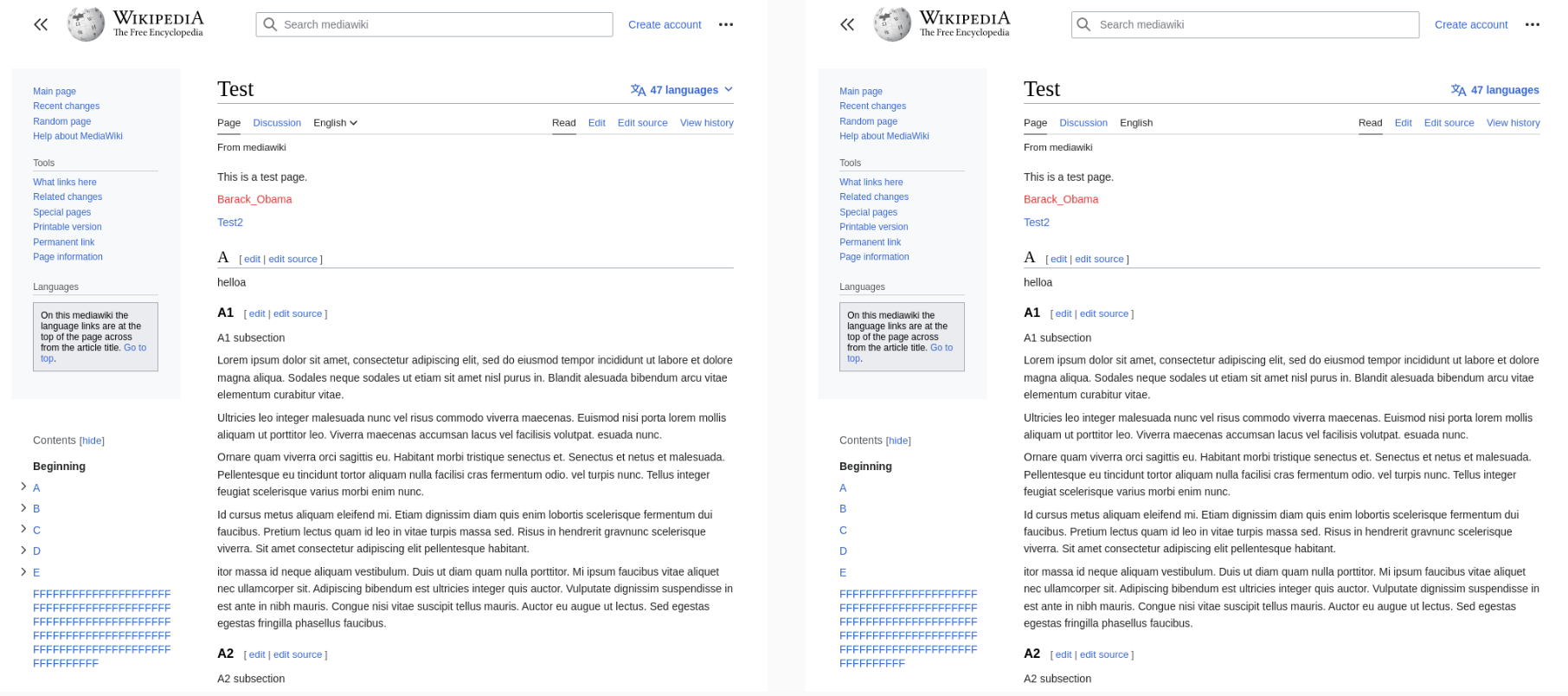
Each feature we completed was coupled with a significant risk that it would deviate from its meticulous design spec as time passed. For example, one of our most frequent regressions involved the search component. The dimensions of its input kept changing in undesired ways, or the position of its magnifying glass icon moved as if an invisible magnet on the page was pulling it.
We fell into a cycle of changing code, causing visual regressions, spending time fixing those regressions and then having similar ones occur in as little as a few weeks.
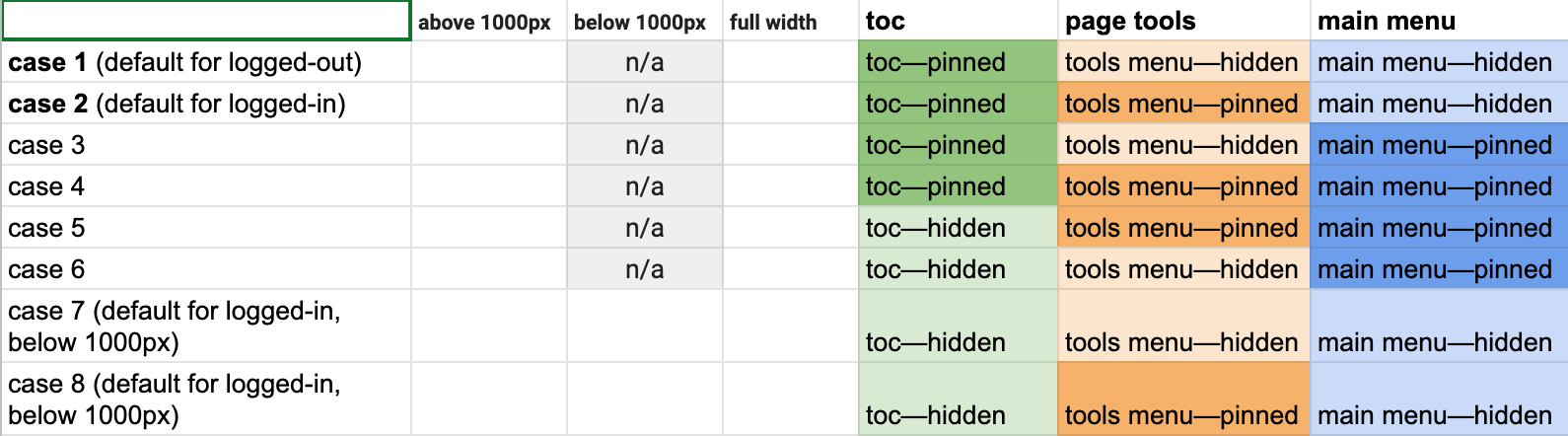
Also, our UI was only getting more complex — we wanted certain elements only to show when logged in or logged out and only when the viewport was above or below a specific breakpoint. The content needed to be centered, but only when the table of contents wasn't pinned next to it. The table of contents had to collapse into the page toolbar when the user clicked its "hide" button, but only if the sticky header wasn't showing. Otherwise, it needed to be in the sticky header. Unless, of course, the viewport was at a small width. If that happened, the table of contents menu button must be at the top of the viewport but without the sticky header showing.
Using the Jest Testing Framework, we tried writing unit tests for as much of the JavaScript logic involved in these situations as possible. We also leveraged Jest's snapshot feature, which compares changes in the outputted DOM to detect any undesired class or element changes.
But there was still a gap in test coverage. Much of the skin's complexity did not live in JavaScript or HTML but in CSS, and this gap was getting exposed more and more frequently. We needed something more than unit and integration tests could provide. Something that could test what users see.
Visual testing pixel by Pixel
From March through June 2022, we experimented with visual testing and tried incorporating it into our workflow. At its most basic level, a visual test, also known as a "visual regression test", involves:
- Capturing a screenshot of a page or element (known as the "reference" or "baseline" screenshot).
- Making changes to the code
- Capturing another screenshot of that same page or element (known as the "test" screenshot)
- Comparing and highlighting the difference between the two screenshots
Not knowing whether this experiment would be helpful, we leveraged existing open-source visual regression testing software to point at a Dockerized instance of MediaWiki (the software that powers Wikipedia), developed a CLI and logic that made it easier to compare two different states of MediaWiki, and called the tool Pixel.
For MediaWiki to resemble anything close to the production environment that users see on English Wikipedia requires many git submodules in the form of extensions. In addition to the core code of MediaWiki, each of these extensions can cause visual changes to the page.
Instead of storing and managing hundreds of reference images under source control (a common strategy with visual testing) and asking maintainers of these extensions to keep the reference images up-to-date, we made Pixel compare one state of MediaWiki with another state and produce a report that shows the visual differences.
The two most common workflows are:
- Comparing the
HEADof themasterbranches with a Gerrit patch. This is primarily used during code review. - Comparing the latest release branches of MediaWiki with the
HEADofmaster. A new release of Wikipedia usually gets deployed every week. By comparing the last release withmaster, we roughly see the visual changes the next release will introduce. We publish these reports for anyone to view at pixel.wmcloud.org.
Impact of visual regression testing
Within the first week of our team's use of visual testing, we caught unintended changes during the code review process. In addition, a lot of time usually spent manually testing visible changes on a local server was replaced by our visual tests doing that work for us in a matter of minutes. As a result, confidence in releases also increased.
The benefits we saw from visual testing continue today. We frequently catch unintended visual changes with our tests and found it valuable enough to continue using it in our workflow. Frankly, I have a hard time reviewing any code without it.
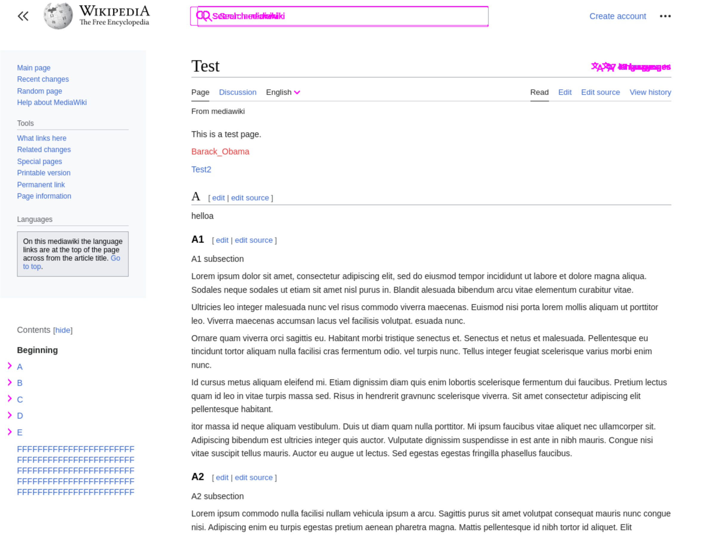
Video showing a failed visual test with a difference in spacing between the title of the article and the table of contents icon button, as well as a difference in the width of the table of contents. In the video, the user can see the reference, the test image, and the differences highlighted in pink.
Still, we've experienced several difficulties along the way:
- Because our visual tests compare each pixel, they can flag changes that might otherwise be undetectable to humans, causing noise in the report's results. Adjusting the difference threshold in the tests to ignore subtle changes can alleviate this problem but comes with the risk of letting real regressions pass. Therefore, we use a difference threshold of 0.04% for most tests.
- Writing tests that capture the page at the right moment can be a pain. Visual tests depend on a stable page. To achieve this, our tests fast-forward through any animation on the page and wait for idle moments in the network and main thread before taking a screenshot. This strategy works most of the time.
- Sometimes we have issues determining whether a visual change is intentional and who caused it.
Looking toward the future
We still have a long way to go, but we are improving. Our desktop test suite captures 140 screenshots and tests five different viewport widths. Despite this coverage, we still have visual regressions that slip into production — and too many. But most of these result from a need for more visual tests rather than a failure of the existing tests.
So, we will continue to expand the coverage of our visual test suite by adding more tests and scenarios. With each new visual test we write, we gain an unfair advantage in the "Spot the Difference" game. And the difference between where we were before visual testing and where we are now is a step in the right direction.
Resources
-
If you're a Wikimedia developer wanting to use visual testing on your team, you might be interested in Pixel
-
If you're wanting to use visual testing outside of Wikimedia projects, you might be interested in Playwright or BackstopJS
-
To learn more about the biggest update to Wikipedia's look on desktop in over a decade, check out: