How to Build Tailwind CSS Dark Mode
Have you ever visited a website in a dark room only to be greeted by thousands of blindingly bright white pixels? If so, it probably wasn't a pleasant experience.
That's why "dark mode" has become a popular option for websites. It allows users to switch a website's color scheme from light to dark, providing a more comfortable experience in low-light conditions. A website that offers a dark mode option may also:
- increase reading rates for people with cataracts and other visual disorders
- reduce power use by 63% on AMOLED screens
- promote better sleep by emitting less blue light, although it's debatable
- look elegant and beautiful
In this article, you'll learn how to implement a dark mode theme toggle using Tailwind CSS, one of the most popular CSS frameworks at the time of this writing. Nevertheless, many concepts presented here can apply to other dark mode implementations.
Using the dark mode variant class in Tailwind CSS
Tailwind CSS allows you to style elements easily using a set of
utility classes — and Adding dark mode support is no different. Prefix
any supported class name with dark:, and that class will only become
active when the user has enabled their operating system's dark mode
setting.
The following example displays a box that defaults to a white background with dark gray text if the user hasn't enabled dark mode on their operating system. If they have enabled dark mode, the box will have a dark gray background with white text:
<div class="h-full rounded-lg bg-white p-4 text-gray-900 shadow-lg dark:bg-gray-700 dark:text-white"> <span class="dark:hidden">Light mode</span> <span class="hidden dark:block">Dark mode</span></div>Also, switching between dark mode and light mode on your operating system changes the website's theme:
Video showing that switching to dark mode on MacOS gives the example box have a dark background color. Switching to light mode changes the example box's background color to a lighter color.
How does this happen?
Inspect the styles of the <div> above when dark mode is active.
You'll see that the dark: prefix adds a prefers-color-scheme media
query that wraps around the background-color and color properties
so that the styles only become active when the user has enabled dark
mode on their device:
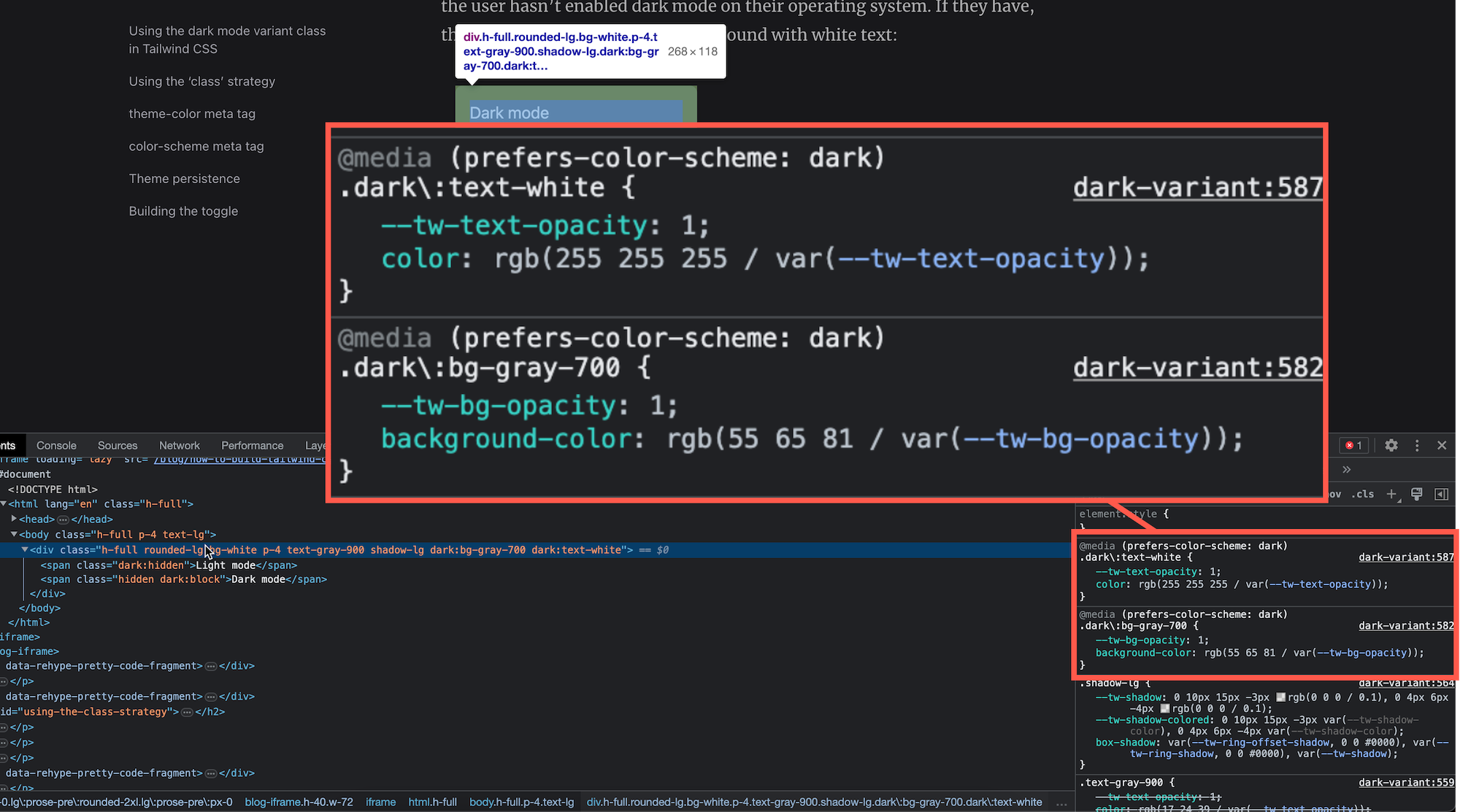
/** default or light mode styles */.bg-white {  --tw-bg-opacity: 1;  background-color: rgb(255 255 255 / var(--tw-bg-opacity));}
/*dark mode styles that will only apply if the user has enabled darkmode on their system*/@media (prefers-color-scheme: dark) {  .dark\:bg-gray-700 {    --tw-bg-opacity: 1;    background-color: rgb(55 65 81 / var(--tw-bg-opacity));  }}
By default, the dark: prefix relies on the device's theme setting
via the prefers-color-scheme media query. But what if you wanted to
add a toggle button to your website that allowed users to switch to
themes independent of their system's preference?
Using the 'class' strategy
To support switching themes using a toggle button, you need to toggle
a dark class on the html element when the user has clicked a
toggle. Tailwind calls this the class strategy.
To enable the class strategy, modify your tailwind.config.js file
as follows:
module.exports = { // Determine whether dark mode is enabled from the `dark` class on // the `html` element. darkMode: "class", // ...};Next, you must implement behavior that adds or removes the dark
class when the user clicks the toggle button. A naive implementation
might look like the following:
const button = document.querySelector("button");button.addEventListener("click", () => { // Add or remove the 'dark' class from the 'html' element. document.documentElement.classList.toggle("dark");});Easy, right? Well, there are a couple of additional considerations when toggling the theme.
theme-color meta tag
Adding a dark mode toggle to your website won't affect the surrounding
color of the browser's user interface (UI). But there is a <meta>
tag that can help with that. The theme-color meta tag suggests a
color for the browser's UI. Browsers that
support this meta tag —
most commonly found on mobile devices — can help make your website's
theme look more consistent:
<meta name="theme-color" content="#4285f4" />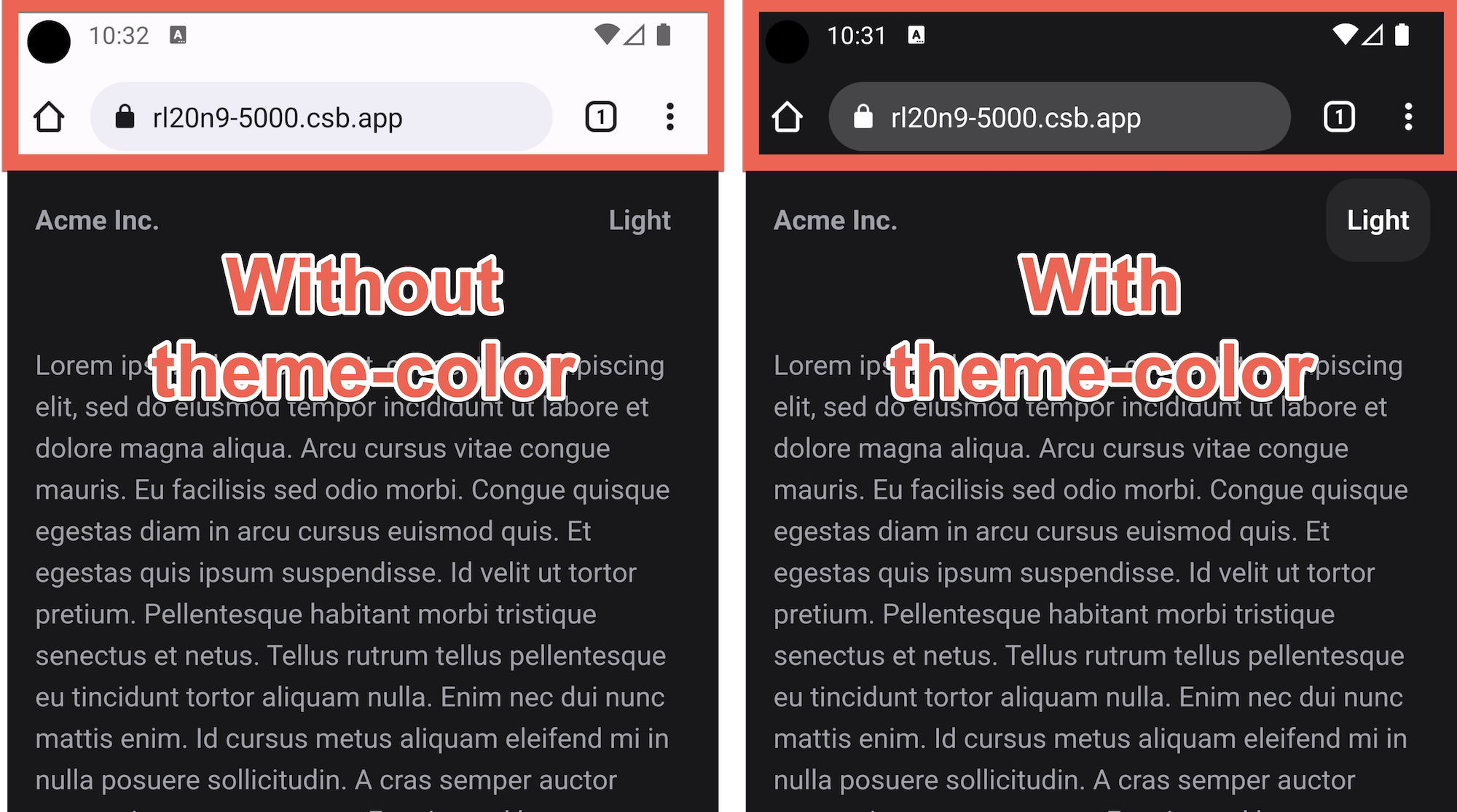
color-scheme meta tag
The second meta tag, named color-scheme, controls the default
appearance of
form controls, scroll bars, spellcheck underlines, and more:
<meta name="color-scheme" content="dark" />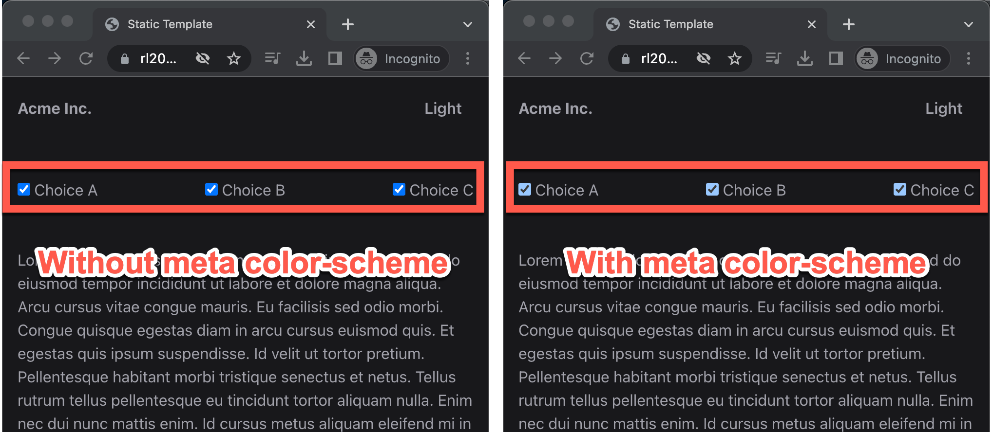
Theme persistence
For the best user experience, when a user selects a theme with a
toggle, it should "persist" after they reload the page or navigate to
a different page of your website. You'll need to save their choice in
the browser. You can use a cookie or localStorage, but
localStorage is more commonly used.
To support persistence and avoid a
flash of unstyled content,
add an inline script in the <head>. Why? Inline scripts block the
browser from parsing more HTML and are
render-blocking.
Render-blocking scripts are usually undesirable from a performance
perspective because they delay the user from seeing anything on the
screen, but that's an advantage in this case because we don't want
the browser to render anything until we know which theme the website
uses. Fortunately, the inline script we'll add is minimal and will
only take a few milliseconds to execute, so the performance impact
will be low:
<!DOCTYPE html><html>  <head>    <!--Render-blocking inline script-->    <script>      // Check if the user has previously toggled the theme.      var theme = localStorage.getItem("theme");
      if (theme === "dark") {        // Switch to dark mode.        document.documentElement.classList.add("dark");      }    <script>    ...
It's tempting to think that users who prefer dark mode will flock to any theme button you add to the page. But most users won't bother customizing their experience — they just want to get things done. Therefore, it's essential to have a sensible default. We can use the system's color theme as a default if the user hasn't used the toggle button:
<script>  // Check if the user has previously toggled the theme.  var theme = localStorage.getItem("theme");
  if (    theme === "dark" ||    // Default to the system's setting.    (!theme && window.matchMedia("(prefers-color-scheme: dark)").matches)  ) {    // Switch to dark mode.    document.documentElement.classList.add("dark");  }<script>
We can also toggle the theme-relevant <meta> tags discussed
previously here:
<!doctype html><html>  <head>    <meta      class="meta-theme"      name="theme-color"      content="#FAFAFA"      data-other="#18181B"    />    <meta      class="meta-theme"      name="color-scheme"      content="light"      data-other="dark"    />    <script>      // Check if the user has previously toggled the theme.      var theme = localStorage.getItem("theme");
      if (        theme === "dark" ||        // Default to the system's setting.        (!theme &&          window.matchMedia("(prefers-color-scheme: dark)").matches)      ) {        // Iterate through the relevant meta tags and change to value for dark mode.        var metaTags = document.head.querySelectorAll(".meta-theme");        for (var i = 0; i < metaTags.length; i++) {          var meta = metaTags[i];          var other = meta.dataset.other;          meta.dataset.other = meta.content;          meta.content = other;        }
        // Switch to dark mode.        document.documentElement.classList.add("dark");      }    </script>  </head>  ...</html>
Building the toggle
Now let's focus on building the actual toggle. We'll start by writing the HTML for a minimal toggle button:
<button class="theme-toggle block rounded-full p-3 hover:bg-zinc-100 dark:hover:bg-zinc-800 dark:hover:text-white"> <div class="dark:hidden">Dark</div> <div class="hidden dark:block">Light</div></button>These classes ensure that either "Light" or "Dark" text is displayed
at any given time, but the user will never see both simultaneously.
The button's "Dark" label is shown when light mode is active. When
dark mode is enabled, the "Light" label is shown by the dark:block
class, while the dark:hidden class hides the "Dark" label.
Now we need JavaScript to handle clicks to the toggle button. When the
user clicks the button when light mode is active, we should add the
dark class to the <html> element to enable the website's dark
mode. If dark mode is active and the user clicks the button, we should
remove the dark class from the <html> element.
function enableLightMode() {  document.documentElement.classList.remove("dark");}
function enableDarkMode() {  document.documentElement.classList.add("dark");}
function bindButtonListener() {  // Bind button click listener.  const button = document.querySelector("button");  button.addEventListener("click", () => {    const isDark =      document.documentElement.classList.contains("dark");
    if (isDark) {      enableLightMode();    } else {      enableDarkMode();    }  });}
function init() {  bindButtonListener();}
init();
The next step is adding persistence so that the user's selected theme remains after reloading the page or going to a new page:
function persistTheme(theme) {  localStorage.setItem("theme", theme);}
function enableLightMode() {  document.documentElement.classList.remove("dark");  persistTheme("light");}
function enableDarkMode() {  document.documentElement.classList.add("dark");  persistTheme("dark");}
As in the <head>, we use localStorage to handle persistence. But
instead of retrieving the theme from localStorage, we save it. We
can also toggle the meta tags that we added to the <head>:
function toggleMeta() {  const metaTags = document.head.querySelectorAll(".meta-theme");  for (var i = 0; i < metaTags.length; i++) {    const meta = metaTags[i];    const other = meta.dataset.other;    meta.dataset.other = meta.content;    meta.content = other;  }}
function enableLightMode() {  document.documentElement.classList.remove("dark");  persistTheme("light");  toggleMeta();}
function enableDarkMode() {  document.documentElement.classList.add("dark");  persistTheme("dark");  toggleMeta();}
Finally, it might be nice if the website's theme color changed when
the user changed their system's theme color. We can do that by using
the matchMedia API
function handleSystemChange(e) {  if (e.matches) {    // User has enabled their system's dark mode setting.    enableDarkMode();  } else {    // User has enabled their system's light mode setting.    enableLightMode();  }}
function bindMediaQueryListener() {  // Handle system theme changes.  const mediaQueryList = window.matchMedia(    "(prefers-color-scheme: dark)",  );  if (mediaQueryList.addEventListener) {    mediaQueryList.addEventListener("change", handleSystemChange);  } else {    // In Safari versions < 14, the `addEventListener` API is not    // available, so use `addListener` method instead.    mediaQueryList.addListener(handleSystemChange);  }}
function init() {  bindButtonListener();  bindMediaQueryListener();}
init();
After following these steps, you should now have a dark mode toggle that is functionally similar to the following demo:
Video showing switching between dark and light modes by using the toggle developed from this tutorial.
Check out the full demo. And let there be darkness.